
Matching the Metal Is Not Enough
How to coordinate a touchless faucet and automatic soap dispenser across color, sheen, texture, sensing, cleaning and long-term replacement—without discovering the mismatch after installation.
Two fixtures can share the same finish name and still look unrelated. One may read warmer, darker or glossier; brushing lines may run in different directions; and the pieces may age differently under soap, water and daily cleaning.
A coordinated touchless faucet and soap dispenser is therefore not merely a color choice. It is a small system. The pair must share an intentional visual language while giving designers, installers and facility teams workable answers for power, sensing, soap supply, cleaning and service access.
This report treats finish as one layer of a complete specification. It complements the site’s broader faucet research hub and bathroom-faucet engineering FAQ.
The same silhouette, five distinct design directions
Using the same coordinated fixture geometry makes the finish itself easier to evaluate. These images are visual studies, not proof of a particular coating process. The final specification must name the manufacturer’s exact finish code and documented construction.
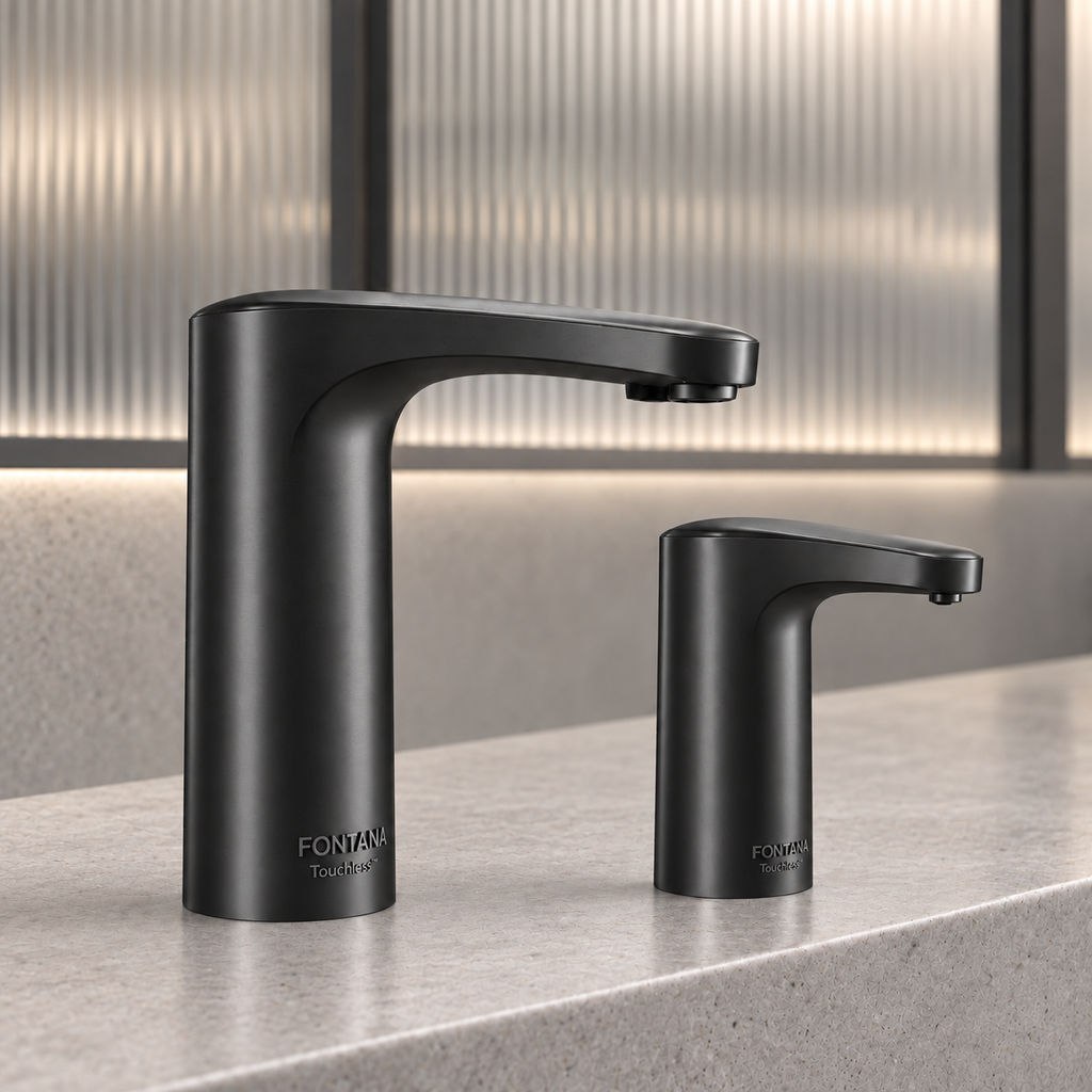
Graphic contrast
Black can make the faucet and dispenser read as precise architectural punctuation. It also reveals mineral residue, dried soap and lint quickly, so the maintenance plan becomes part of the aesthetic decision.
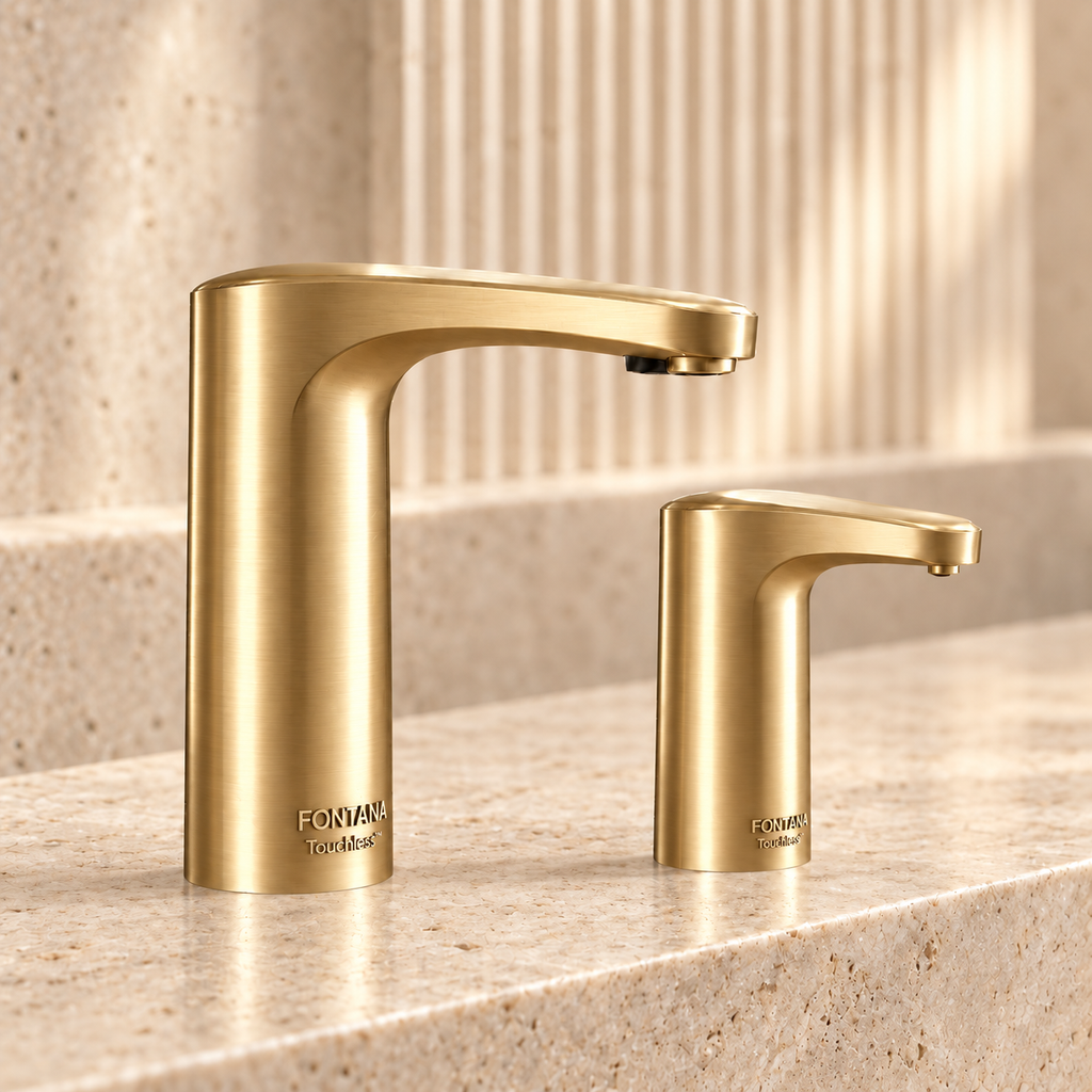
Warm focal point
Brushed gold can soften stone and timber palettes while making the handwashing zone feel intentionally designed. Samples are essential because “gold” varies widely from pale champagne to saturated brass.
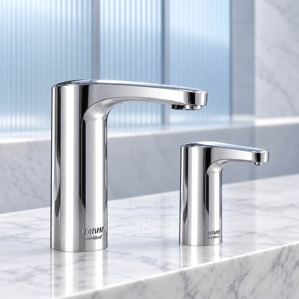
Bright, neutral and revealing
Polished chrome works across many material palettes and reflects surrounding colors rather than imposing a strong hue. Its mirror-like surface makes water marks and fingerprints visible, but it can also make a compact vanity feel lighter.
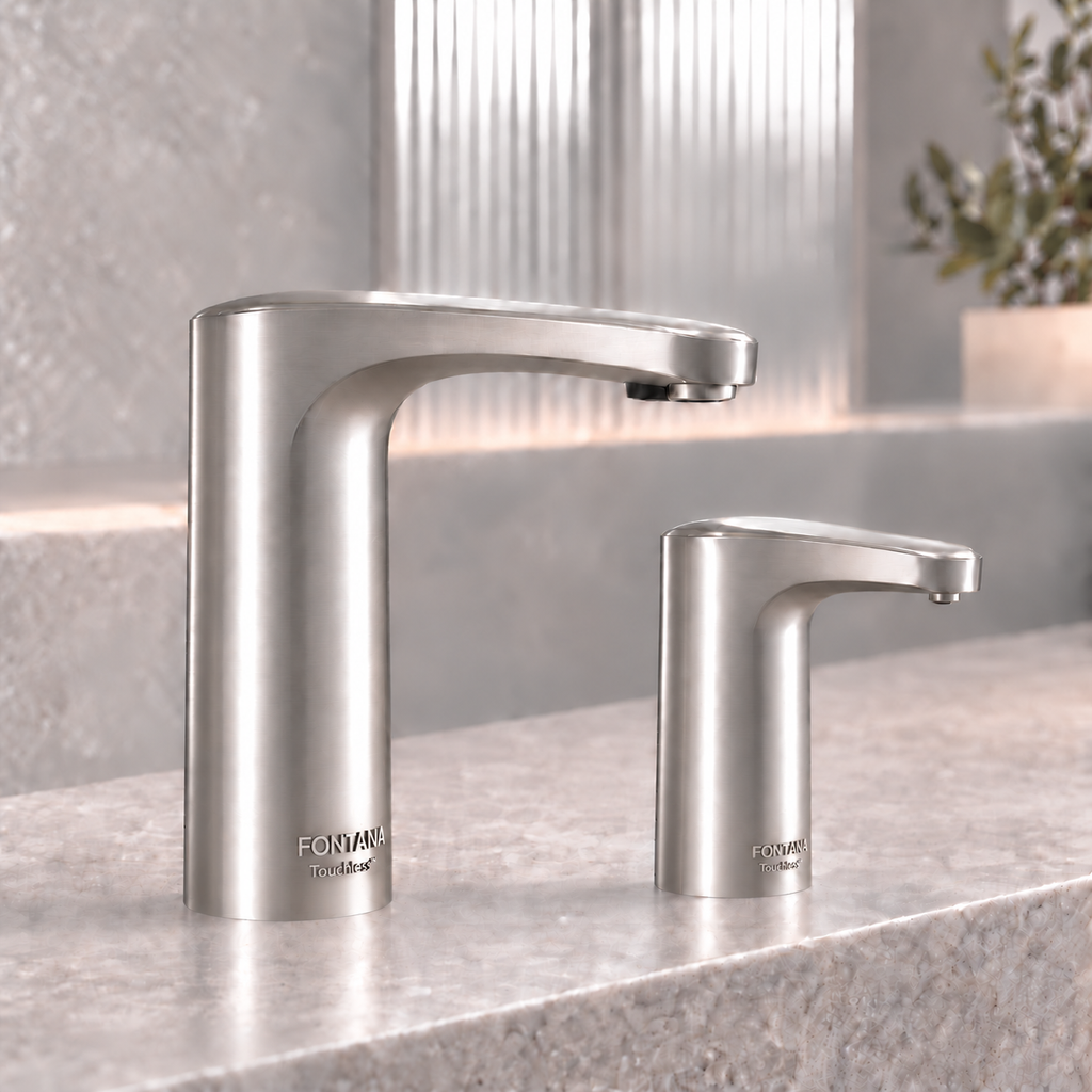
Quiet transition
Brushed nickel often bridges cool stone, stainless accessories and warmer millwork. Confirm undertone and brushing direction; some versions appear yellow-gray while others read distinctly cool.
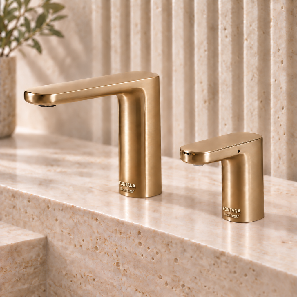
Controlled warmth
A quieter warm metallic can sit between nickel and gold. Because naming varies by manufacturer, specify the exact finish code and approved physical sample rather than relying on a generic color description.
Color, sheen and texture are separate decisions
Many coordination failures begin when “matching” is reduced to color. The human eye also reads gloss level, surface direction, edge sharpness and the way highlights travel across curved forms.
Warm versus cool
Gold may lean yellow, champagne or bronze. Nickel may appear blue-gray or warm gray. Place both fixtures beside the counter material before approval.
Polished versus satin
A polished faucet beside a satin dispenser can look like a mistake even when their base color is close. Specify the sheen, not just the color family.
Brushing and grain
Directional brushing changes with form and viewing angle. Compare cylindrical bases, spouts and dispenser heads under the same light.
| Finish family | Design strength | Maintenance reality | Coordination risk |
|---|---|---|---|
| Polished chrome | Neutral, luminous, familiar | Water marks and fingerprints remain visible | Reflections exaggerate nearby color differences |
| Brushed nickel | Soft, adaptable, low-glare | Fine texture can disguise light handling marks | Undertones and brushing patterns vary |
| Matte black | Strong contrast and contemporary clarity | Mineral deposits and soap residue can stand out | Gloss variation is immediately noticeable |
| Brushed gold | Warmth and premium visual emphasis | Cleaning method must respect the coating system | Gold tones differ dramatically across suppliers |
| Bronze or dark warm metal | Depth, character and hospitality appeal | Patina expectations should be defined | Living finishes and stable coatings age differently |

A set simplifies selection—not due diligence
Buying the faucet and dispenser as a coordinated set can improve the odds of consistent scale, shape and finish. It does not eliminate the need to document every component.
- Record the exact finish code for both fixtures.
- Confirm whether power supplies and mixing components are included.
- Identify the soap reservoir, dose adjustment and refill route.
- Check compatible soap type and viscosity against the current product documentation.
- Coordinate sensor zones so handwashing and soap dispensing feel intentional.
BathSelect’s touchless faucet and dispenser collection provides examples across several finish families. Treat each listing as a starting point and request current drawings and finish confirmation for the chosen configuration.

Cleaner counters demand cleaner documentation
Wall-mounted faucet and dispenser sets can produce the calmest composition in the room. They also require early agreement on mounting heights, centerlines, projection, wall depth and service access.
Show the faucet outlet and soap nozzle on the interior elevation. Coordinate both with the basin’s usable area rather than spacing them only for visual symmetry. The soap should land in an intuitive hand position without allowing drips to collect on the deck or floor.
What other finish and control strategies reveal
These unranked references are included to broaden the design conversation. They do not represent equal applications, identical specifications or universal recommendations. Their value is in showing how finish, form and control type interact.
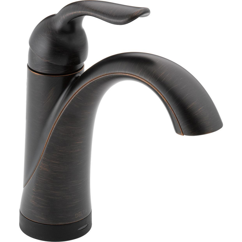
Dark bronze in a residential language
The Lahara Touch2O model demonstrates how a warm, dark finish can support a traditional residential silhouette. It is touch-activated rather than a commercial automatic faucet, so it should not be substituted as though the controls were equivalent.
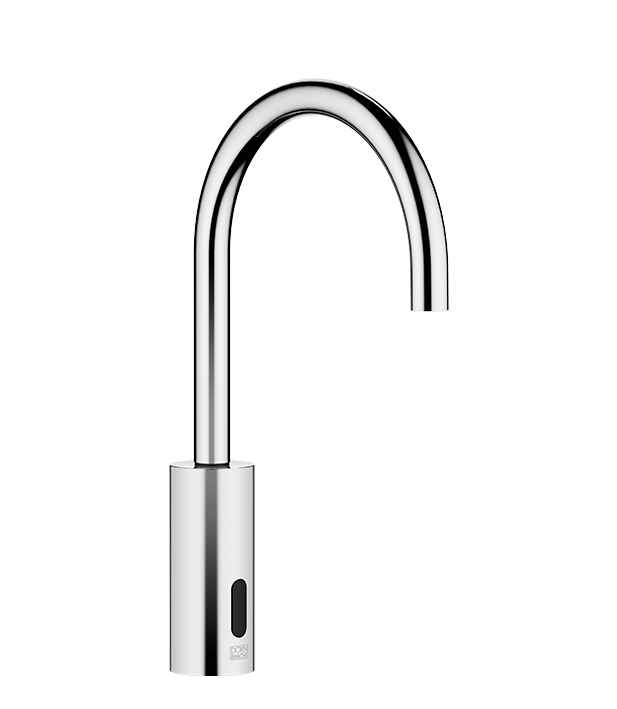
Documented finish language matters
Dornbracht identifies this touch-free wall-mounted variant as brushed dark bronze PVD. That precise manufacturer wording is more useful in a schedule than a generic “bronze” description.
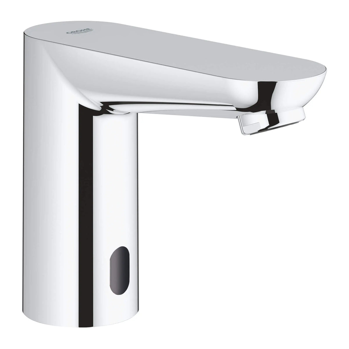
Chrome as a neutral baseline
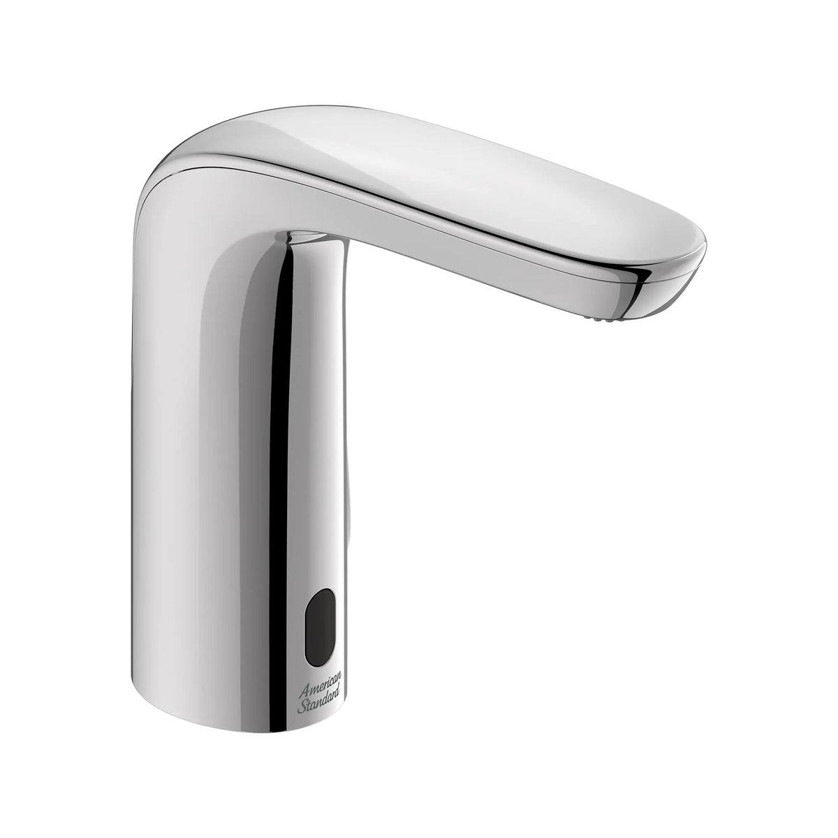
A compact chrome sensor faucet can support a broad material palette and make replacement coordination more straightforward. Confirm the exact mixing and power configuration rather than relying on appearance alone.
Service strategy before finish expansion
Above-deck access is a reminder that long-term maintenance deserves equal weight with finish selection. Verify current options, included parts and the exact finish availability for the required configuration.
Finish coordination cannot rescue the wrong faucet
The faucet still has to fit the basin, meet the project’s water-delivery requirements and operate reliably in its intended setting. Efficiency language must also match the application.
The U.S. EPA states that WaterSense faucet labeling criteria apply to private lavatories, not public lavatory faucets. EPA separately notes that public lavatory faucets typically should use no more than 0.5 gallons per minute to be considered efficient and meet plumbing-code requirements. Project teams should therefore avoid transferring private-bathroom labeling claims directly into a public-restroom schedule.
Soap, water and cleaning chemistry become part of the palette
The dispenser creates exposures a faucet does not. Soap may collect near the nozzle, drip onto the counter or contact the dispenser body during refilling. A finish pair that matches perfectly on opening day may diverge if one component receives different cleaning, abrasion or chemical exposure.
Do
- Request physical samples from the actual production finish.
- Review manufacturer care instructions with the facility team.
- Test the approved soap and cleaning products on samples when feasible.
- Document refill access, drip control and wipe-down procedures.
- Keep finish codes and replacement-part references in the closeout package.
Don’t
- Assume matching marketing names mean matching color.
- Describe a finish as PVD unless the manufacturer documents it.
- Use abrasive pads or unapproved chemicals simply because the surface is metal.
- Place the dispenser where routine drips will stain porous stone.
- Approve a coordinated set without reviewing service access for both devices.
What a coordinated approval package should contain
Approve appearance and operation in the same mockup
Install the intended faucet, dispenser, basin and counter material under representative lighting before a major rollout. Review visual match, hand position, sensor response, splash, soap placement, cleaning access and serviceability together. That single exercise is more valuable than comparing isolated finish names on a screen.
Research references
- U.S. EPA WaterSense — Bathroom Faucets
- BestBathroomFaucets.com — research method and independence policy
- BathSelect — touchless faucets and soap dispensers
- Current manufacturer product pages linked within the reference set.